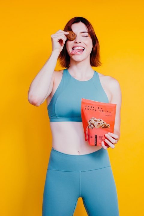
INDULGENT NUTRITION
For Women, run by Women. The Truwomen brand is bold, indulgent and remarkably colorful. The brand tone is established with fashion trends that set the nutrition brand apart from other protein bar brands. Creating a voice heard loudly and visually. Setting the brand voice that’s as bold as the flavors and working in tandem with the tone set by loud visuals.
CLIENT
TRUWOMEN
SERVICES
Brand strategy, Package Design, Print collateral, Email Marketing Campaigns
VISIT WEBSITE


Creative Output
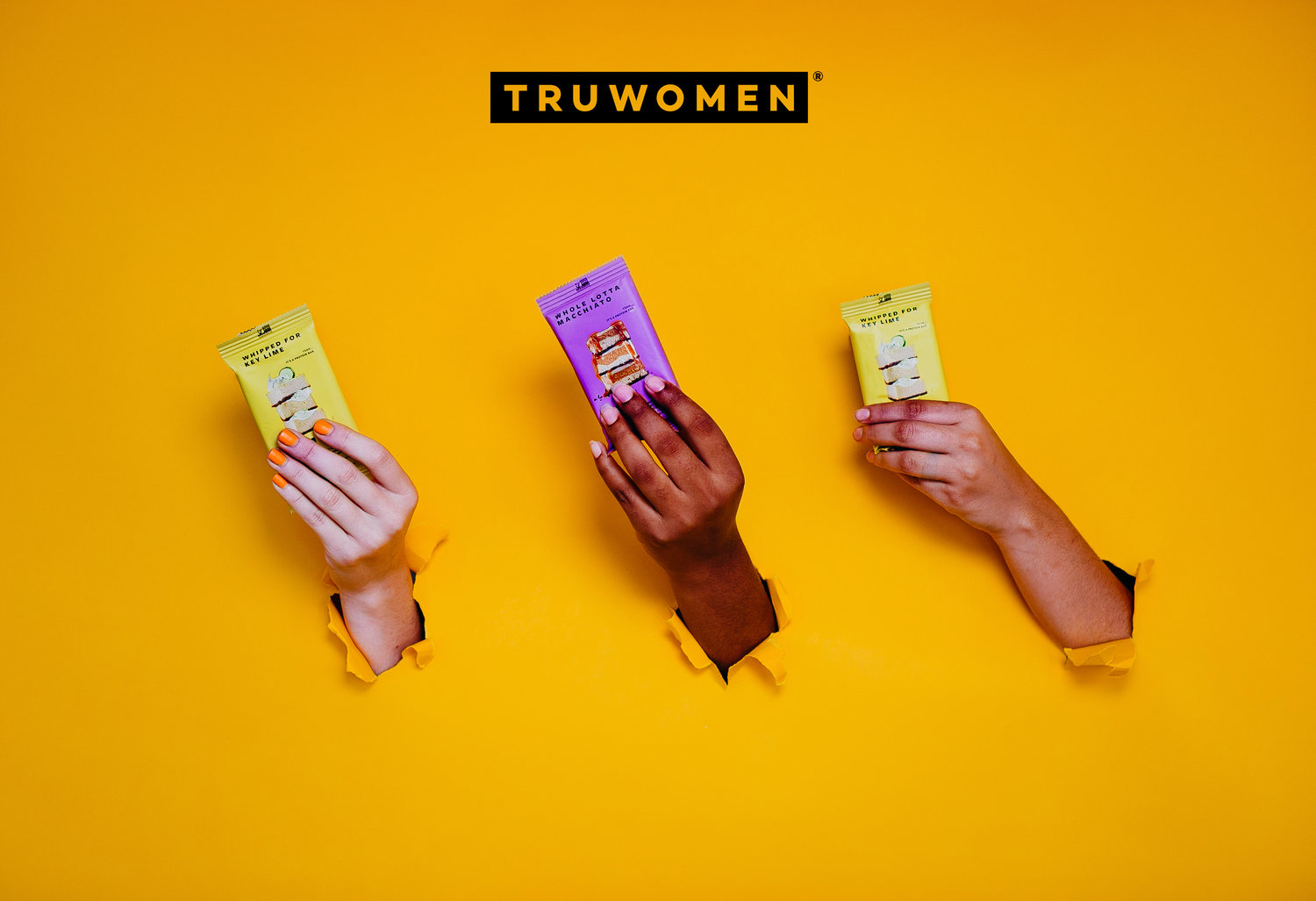
Creating a visual infrastructure that sets the TruWomen brand apart, that’s the goal here. In order to tackle the goal at hand, the brand needed to be visually loud to break the mold of soft “pink” brands that flood the shelf in the women’s supplement space. By doing so we set the shelf presence that is not only eye-catching but also aesthetically clean.


The Technical Integration
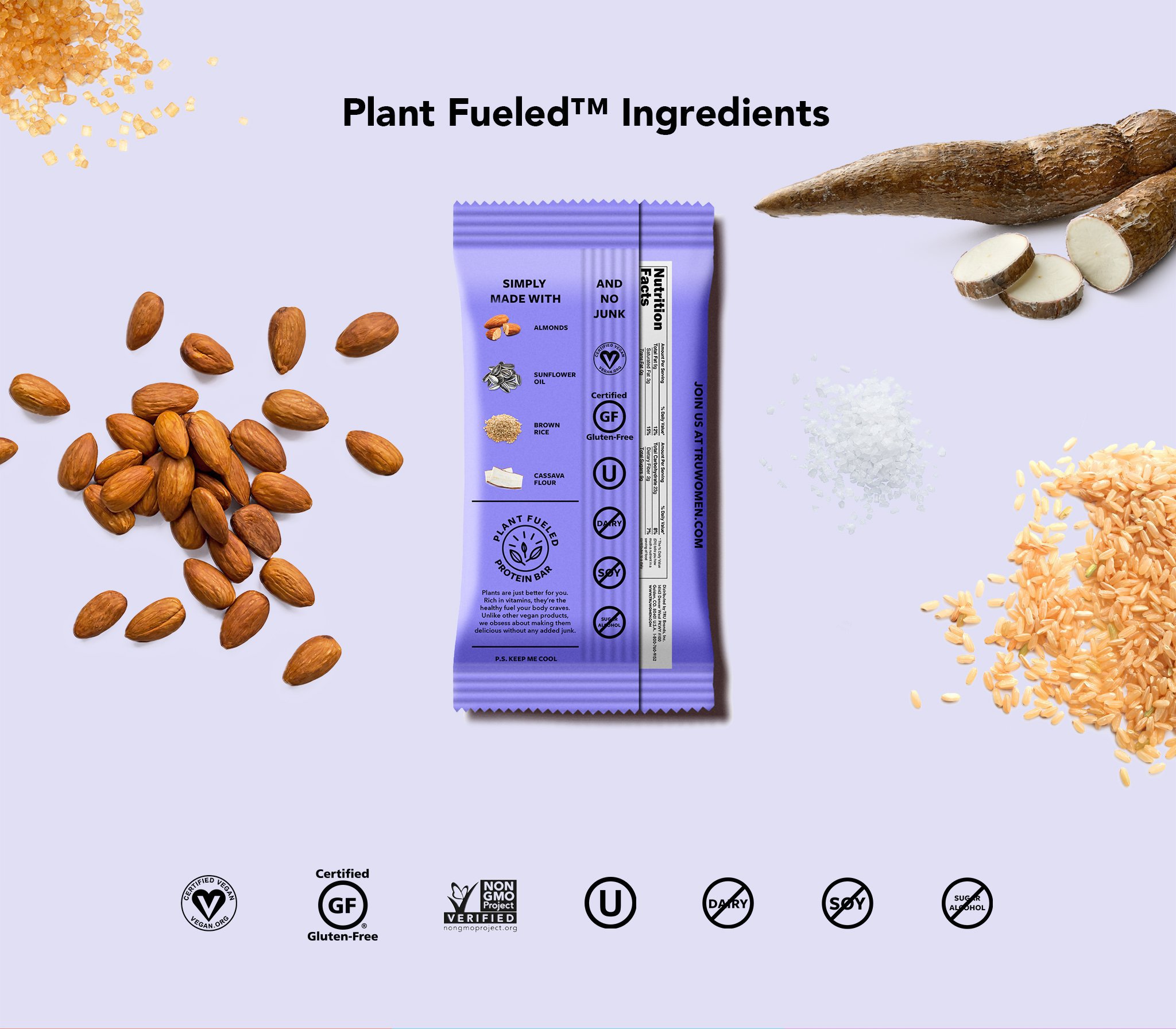
The uniqueness of the true women brand is what attracts consumers. Like previously mentioned its the clean but vibrant aesthetics. That visual hierarchy is through color pallets that are unique to the flavor names and the classically clean typography. The brand was conceived through fashion trends that lead to the color pallets seen, this allows for an everchanging brandscape that is continuously evolving, leaving lots more fun to be had. We are not looking for a cookie-cutter, pink saturated color tones, we are looking to be picked up form the shelf and only set back down when the consumer puts it on display in her kitchen, handbag or office.