Quality you can see,
smell and taste.
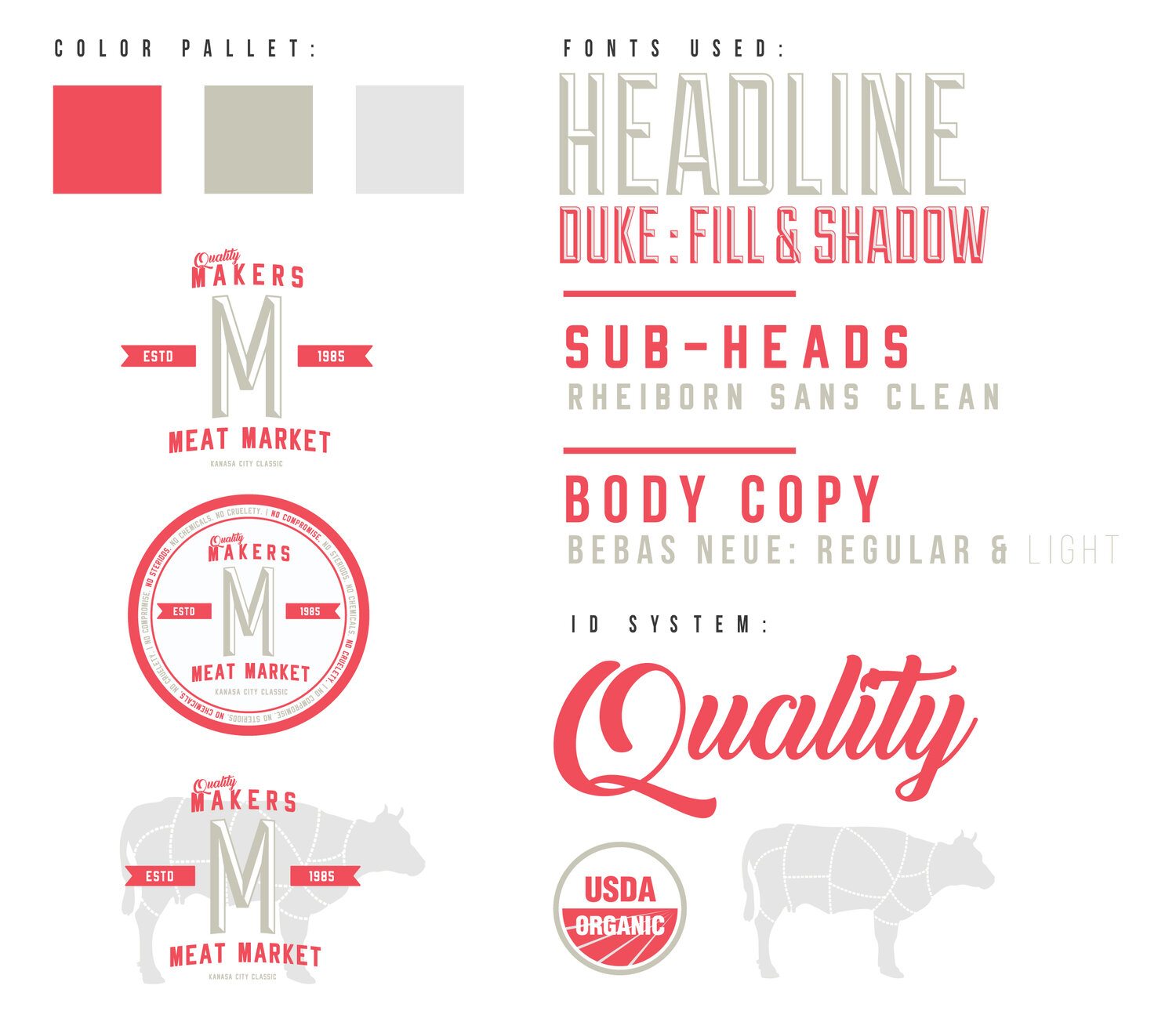
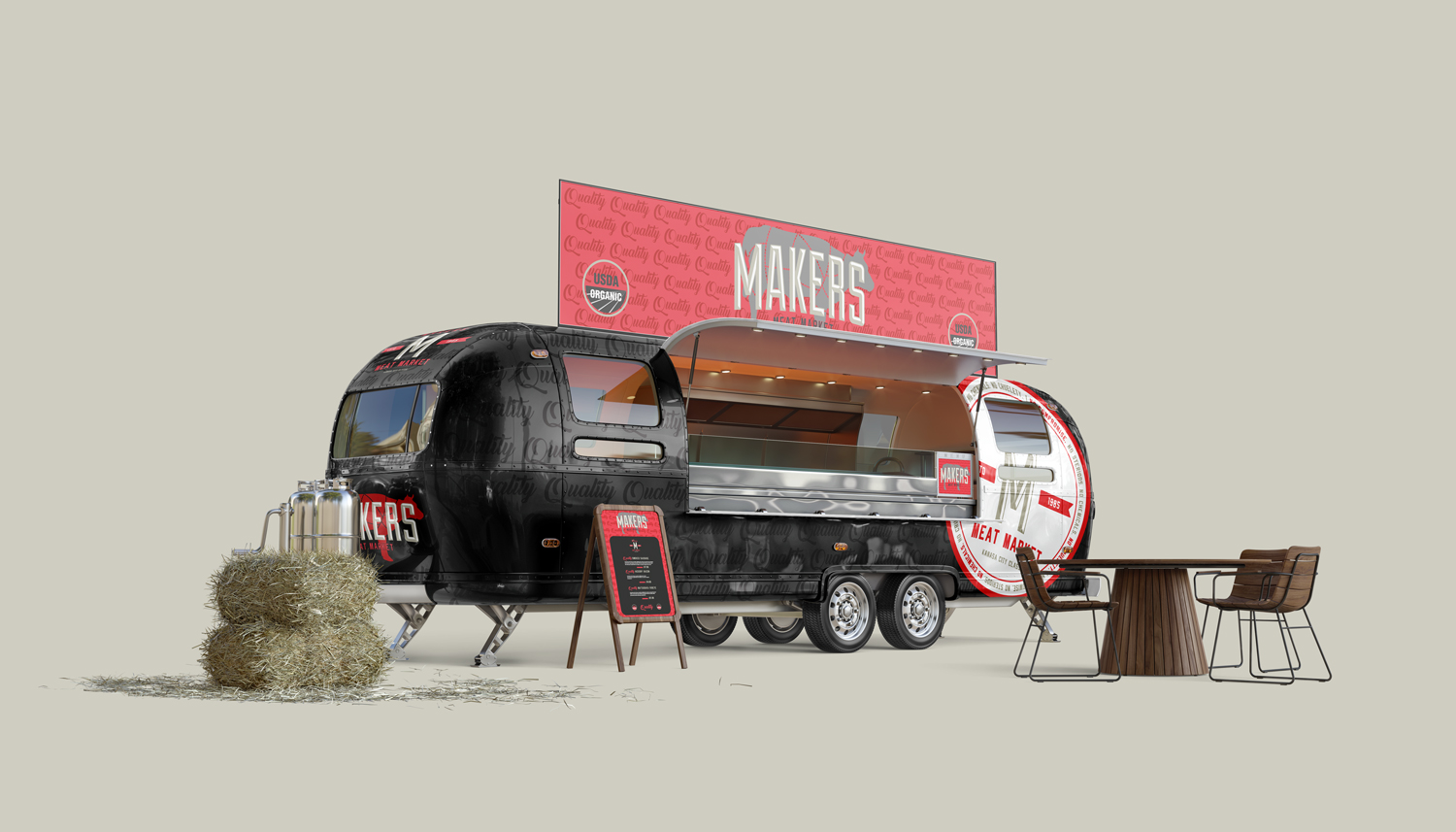
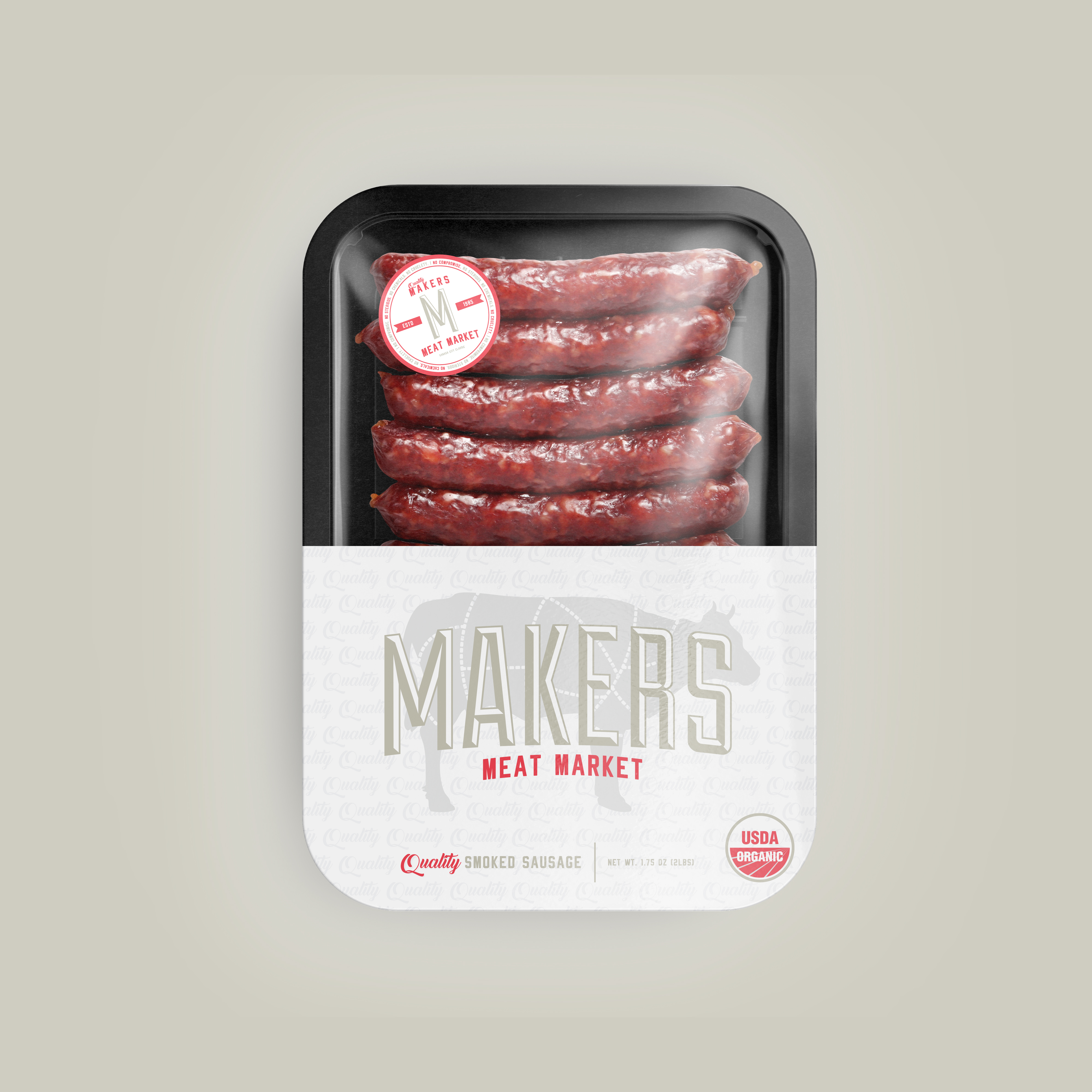
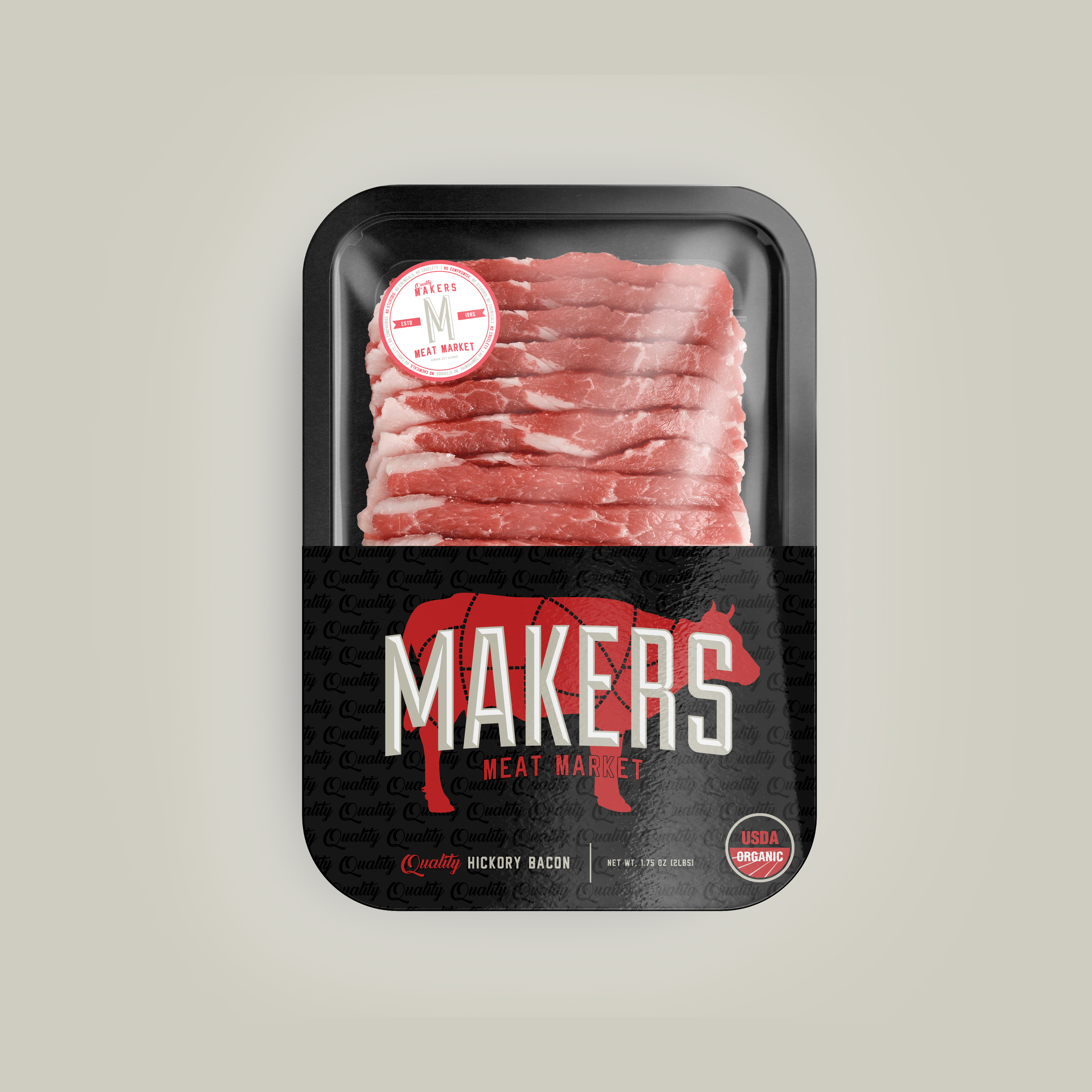
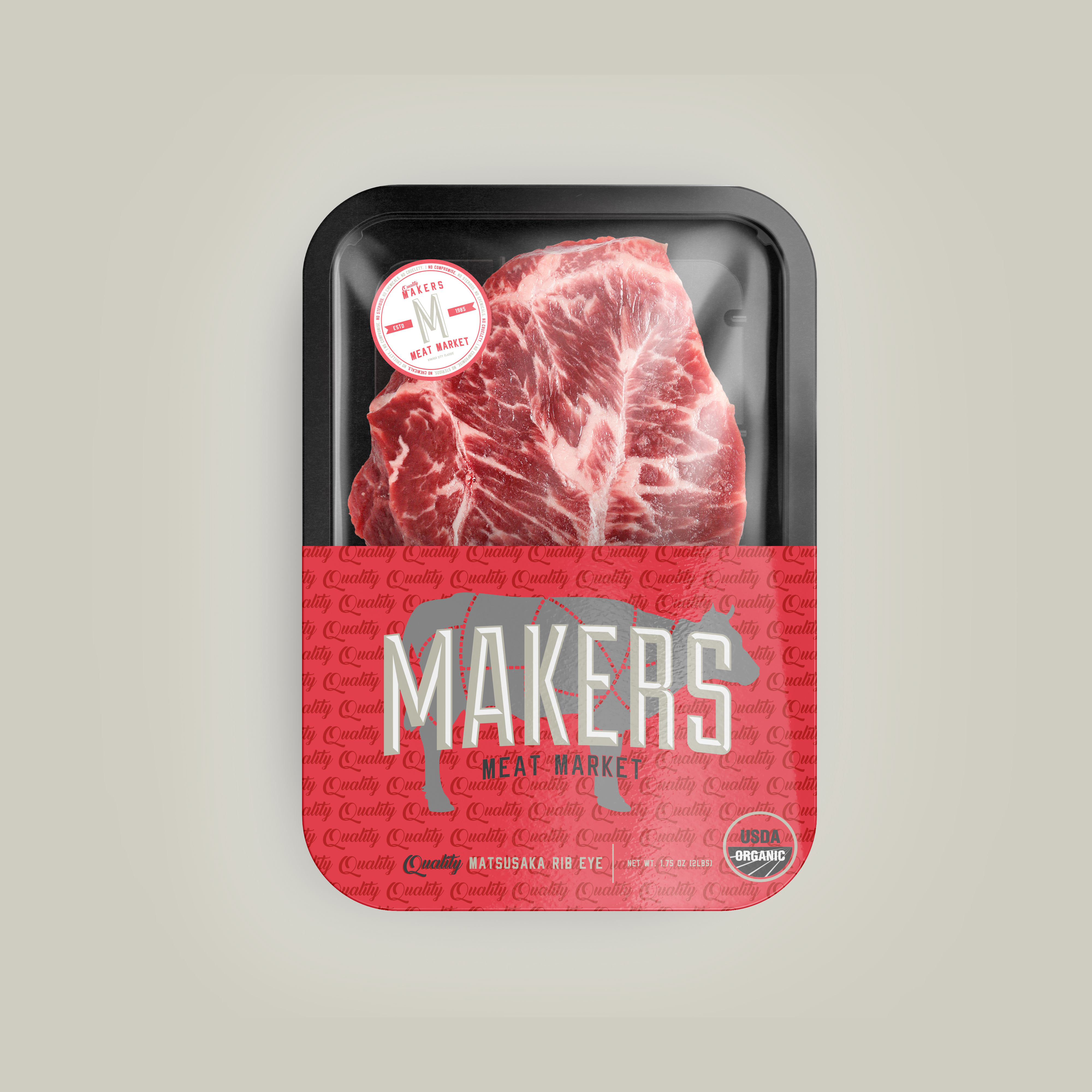
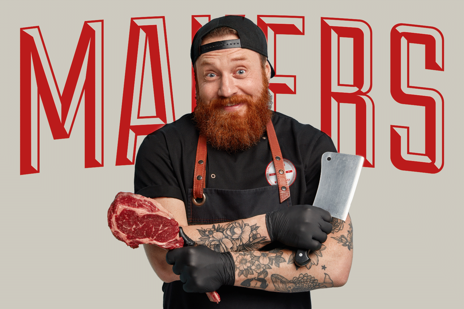
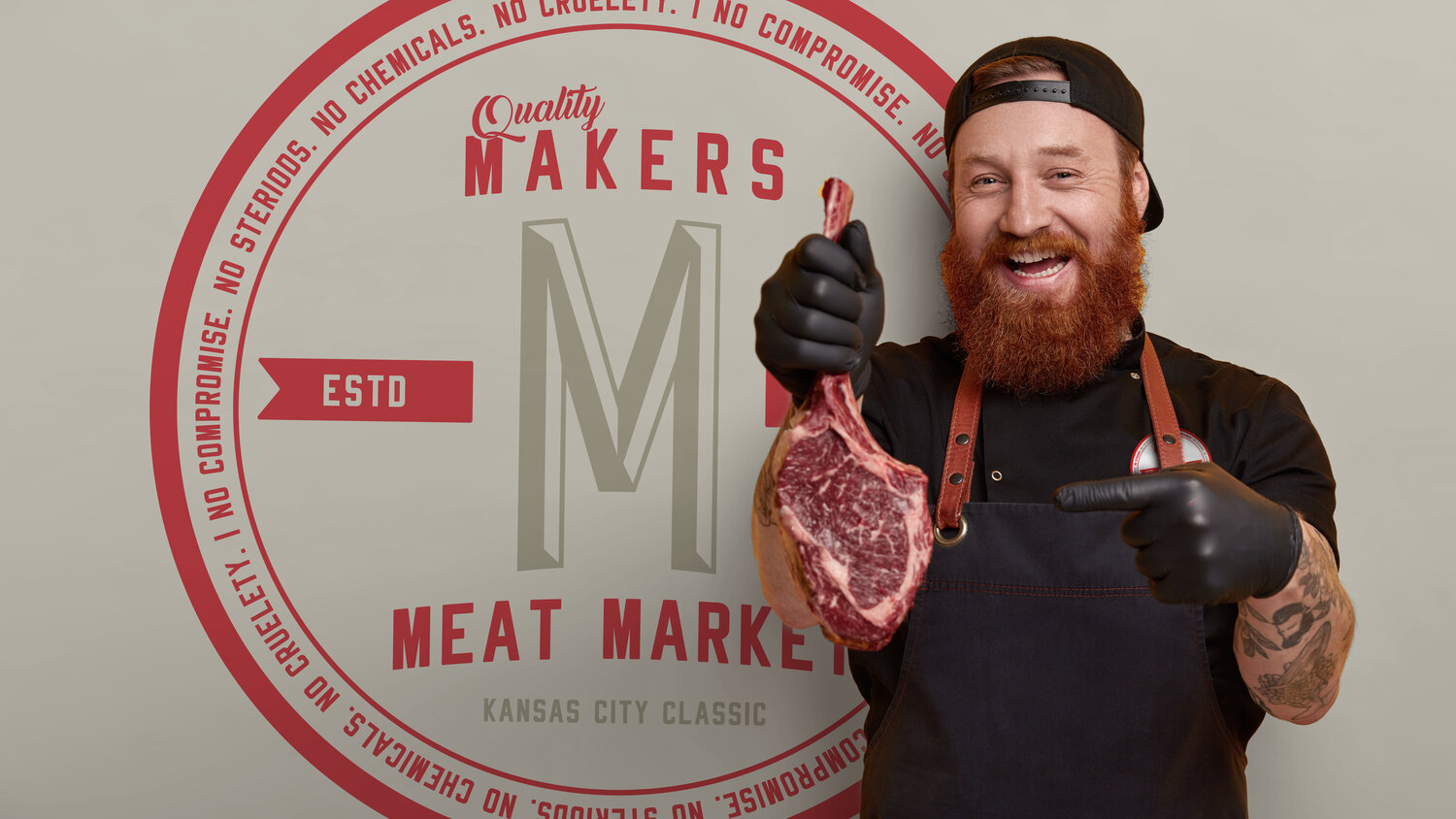
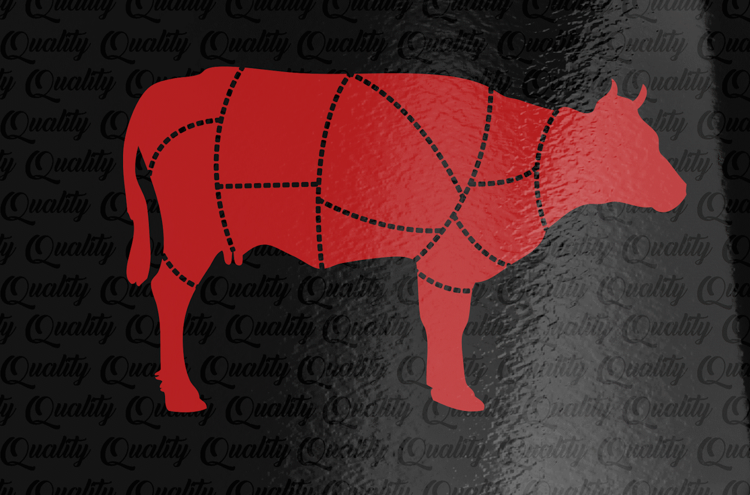
Just like the work Makers Meat Market puts in, we left no stone unturned on this project. It’s not just a brand but we wanted an experience when you see this fresh-packed meat at the local Kansas City meat market. When you pick this package up, you won’t just set it down, you’ll head home with it! We want every detail to speak for its-self on this packaging design and brand identity. From start to finish we worked side by side with the team at Makers to make sure the brand was revitalized and turned into what this brand lives by QUALITY and hard work.
CLIENT
Makers Meat Market
SERVICES
Brand Identity, Package Design, Creative Strategy

Creative Output
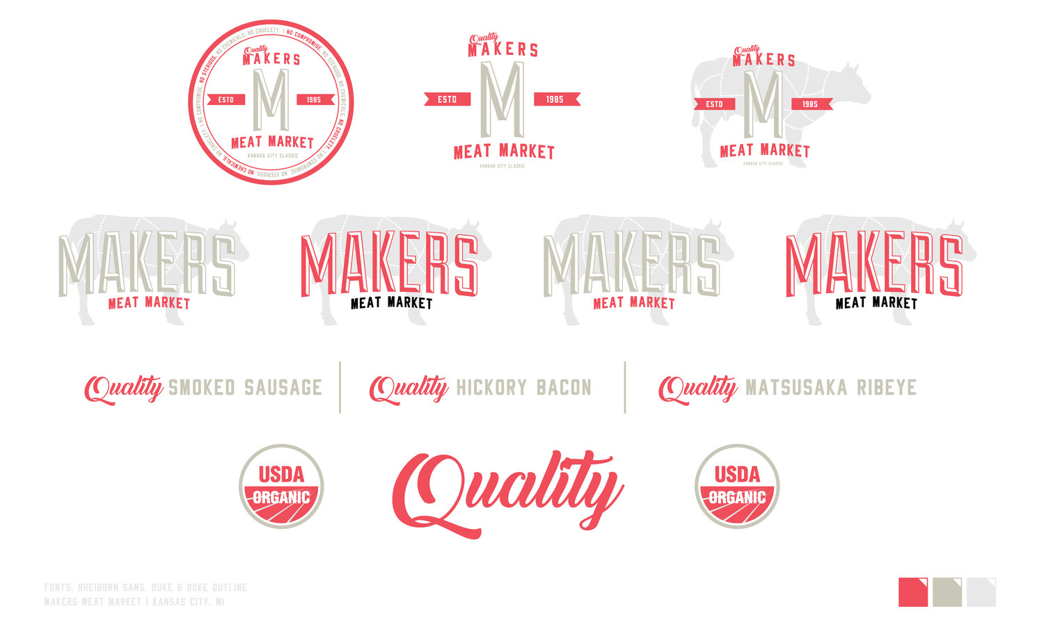
Quality you can see, feel and admire was the target objective. The personality had to be as “BIG” as the owner’s passion he puts into his craft. The brand colors had to speak to the origin of the meat itself, Kansas City, so utilizing a neutral base of colors and building off the classic reds found in the Kansas City area. Hometown pride meets homegrown, steroid-free, non-GMO quality products. Each package that contains a different cut had to have visual similarities but also have different shelf appeal. A color system was in order to identify the differences but have a cohesive brand ecosystem that one would recognize. This brand is much more than a cellophane freezer-wrapped meat from 2,000 miles away… Goal Achieved.